Ready to give your space a minimalist makeover that screams chic without trying too hard? A killer color palette is the secret sauce to nailing that clean, serene, I’ve-got-my-life-together vibe. Minimalism isn’t about boring beige walls (though, no shade, beige can work). It’s about intentional choices that make your home feel calm, cohesive, and—dare I say—Instagram-worthy. Today, I’m spilling the tea on 12 minimalist house color palette that’ll elevate your space from “meh” to “whoa.” Let’s dive in!
Why Minimalist Color Palettes Are Everything
Minimalism is all about less is more. But picking the right colors? That’s where the magic happens. The wrong palette can make your home feel chaotic, cluttered, or—gasp—like a dated 90s sitcom set. The right one? It’s like a warm hug from your space. A minimalist palette creates balance, highlights your furniture, and makes every room feel intentional. Plus, it’s versatile enough to work with your quirky thrift store finds and that overpriced Scandinavian lamp you splurged on. Ready to meet your new color BFFs?
1. Black + White
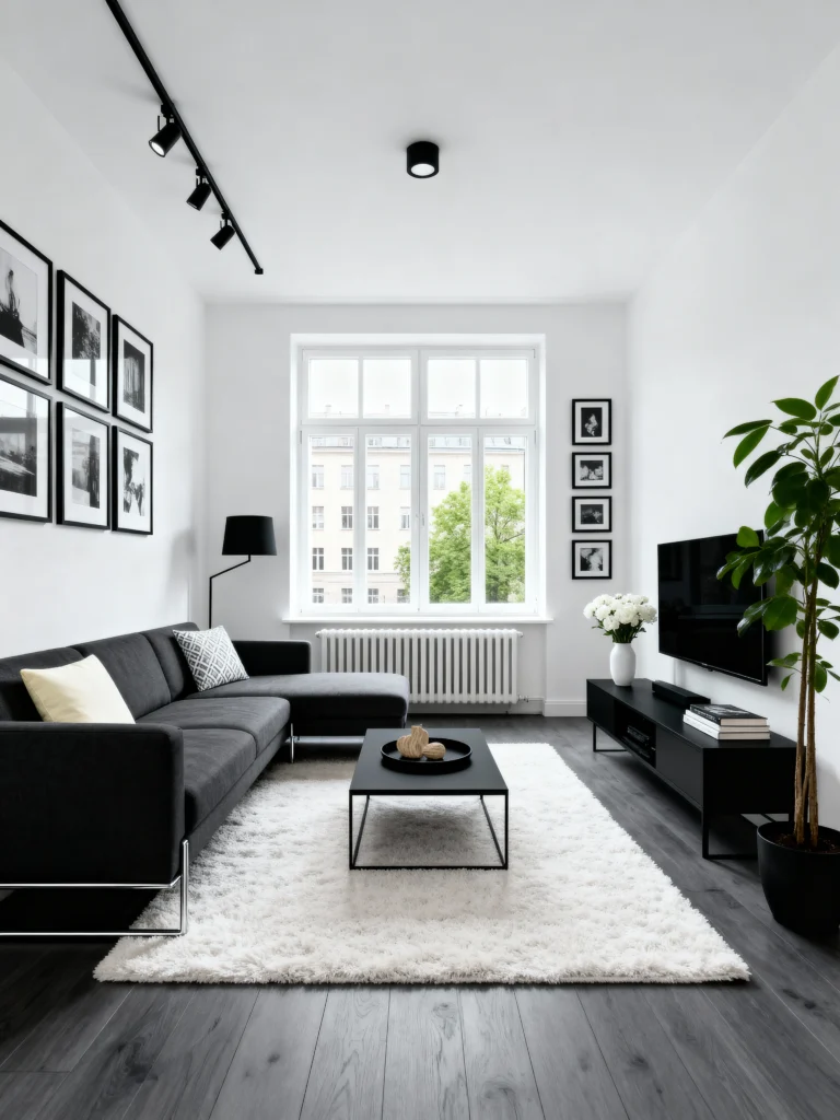
Want drama without chaos? Black and white is your go-to. Think crisp white walls with bold black accents—maybe a black doorframe or a statement chair. This palette is minimalist but packs a punch. I saw this in a friend’s loft, and it was like living in a black-and-white movie, but, you know, in a good way.
2. Earthy Olive + Taupe
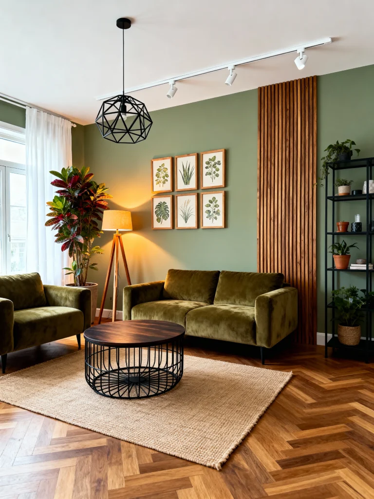
Nature lovers, this one’s for you. Muted olive green paired with soft taupe brings the outdoors in without turning your home into a jungle. It’s earthy, grounding, and surprisingly versatile. I tried olive accents in my kitchen, and now I feel like a fancy chef even when I’m just microwaving leftovers.
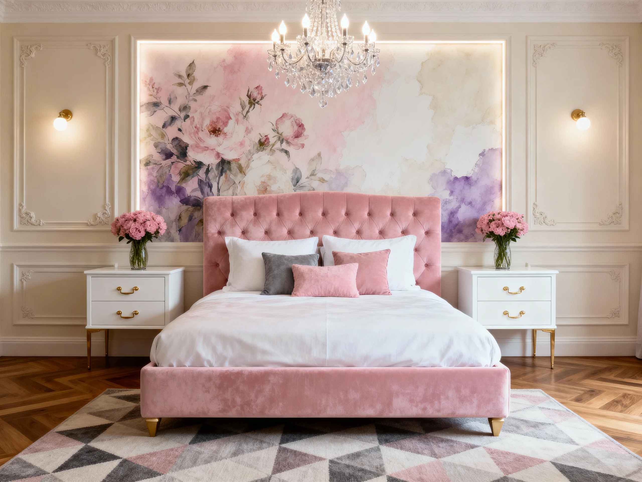
3. Blush Pink + Ivory
Yes, pink can be minimalist! Soft blush pink with creamy ivory is subtle, not Barbie Dreamhouse. It adds warmth without overwhelming your space. I used blush throw pillows in my living room, and it’s like my couch got a glow-up. Why stick to neutrals when you can flirt with a little color?
- Where to use it: Bedrooms, reading corners.
- Pro tip: Keep furniture neutral to let the pink shine.
- Mood: Feminine and inviting.
4. Navy Blue + White

Navy blue is the dark horse of minimalist palettes. Deep navy paired with clean white creates a nautical-but-not-cheesy vibe. It’s bold yet calming, perfect for anyone who wants to make a statement without screaming. My home office has navy accents, and it makes Zoom calls feel slightly less soul-crushing.
5. Terracotta + Sand
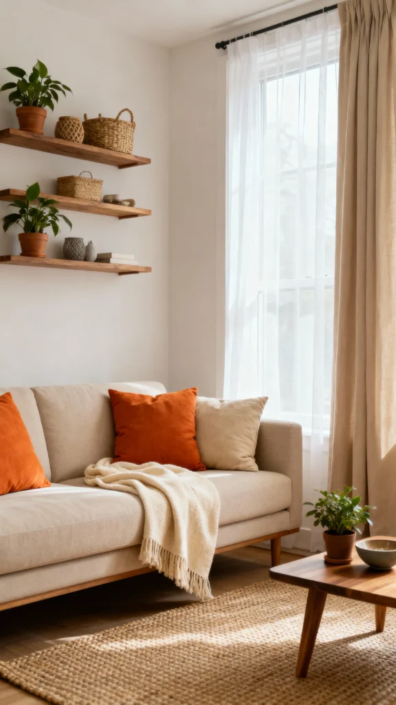
Craving warmth? Rich terracotta with sandy beige is like a desert sunset in your home. It’s minimalist but feels lived-in, not sterile. I saw this palette in a boutique hotel, and I’ve been obsessed ever since. It’s like your home is giving you a warm hug 24/7.
- Where to use it: Living rooms, patios.
- Pro tip: Use woven baskets for texture.
- Mood: Rustic and cozy.
6. Charcoal + Off-White
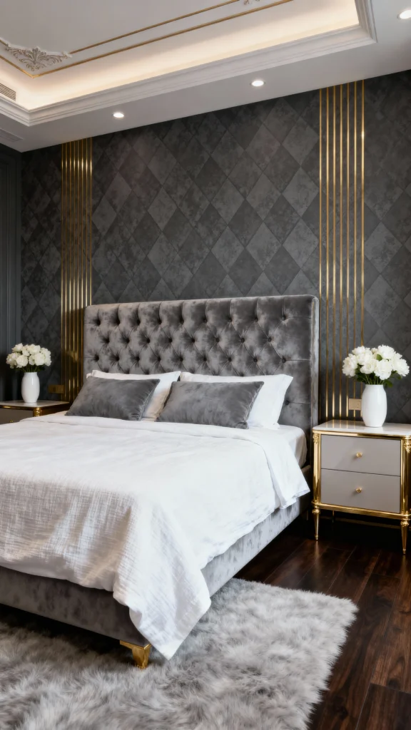
For the moody souls out there, charcoal gray with soft off-white is a dream. It’s dark without being depressing, and it makes your furniture pop. I painted an accent wall charcoal in my bedroom, and now it feels like a boutique hotel (minus the overpriced minibar).
- Where to use it: Bedrooms, media rooms.
- Pro tip: Add metallic accents for glamour.
- Mood: Intimate and luxurious.
7. Sage Green + White
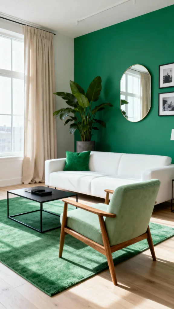
Sage green is having a moment, and I’m here for it. Muted sage with bright white is fresh, modern, and oh-so-calming. It’s like bringing a spa into your living room. I used sage in my bathroom, and now my morning routine feels like a wellness retreat. Why settle for basic when you can have zen?
8. Warm Gray + Buttery Yellow
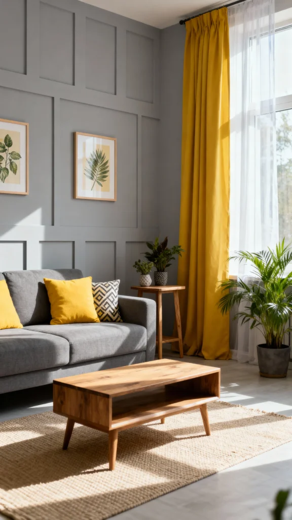
Minimalism doesn’t mean no color. Warm gray with a pop of buttery yellow is like sunshine on a cloudy day. It’s subtle but cheerful, perfect for small spaces. I added yellow cushions to my gray sofa, and it’s like my living room got a personality transplant.
- Where to use it: Small apartments, entryways.
- Pro tip: Use yellow sparingly for maximum impact.
- Mood: Cheerful and modern.
9. Classic White + Soft Gray
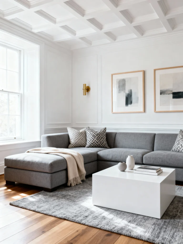
Okay, let’s start with the OG of minimalist palettes. Crisp white walls paired with soft gray accents are like the little black dress of home decor—timeless, elegant, and impossible to mess up. White reflects light, making rooms feel bigger, while gray adds depth without stealing the show. I used this combo in my living room, and let me tell you, it’s like my space got a PhD in sophistication.
- Where to use it: Living rooms, bedrooms, or bathrooms.
- Pro tip: Add wood furniture for warmth. Think oak or walnut.
- Mood: Clean, airy, and effortlessly cool.
10. Monochrome Gray
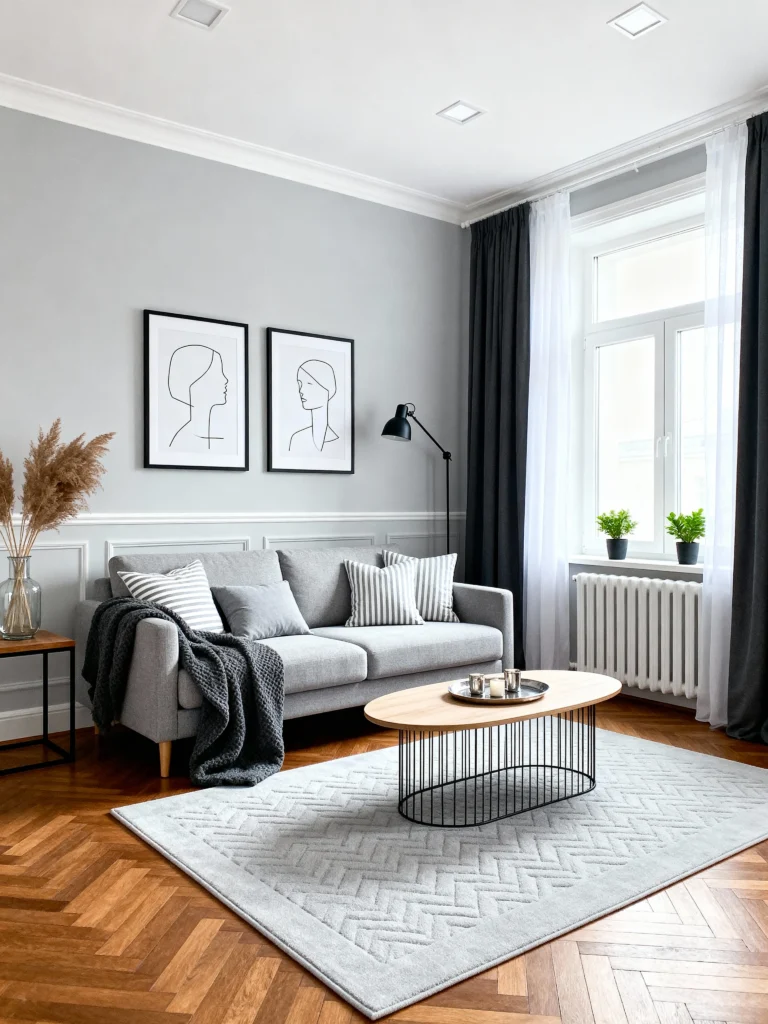
Feeling bold? Go all-in with a monochrome gray palette. Different shades of gray—think charcoal, slate, and dove—create a moody, modern vibe. It’s not boring, I promise. My neighbor tried this in her dining room, and it’s like dining in a sleek art gallery. Just don’t overdo the dark shades unless you want your home to feel like a vampire’s lair.
- Where to use it: Dining rooms, home offices.
- Pro tip: Mix textures like linen and concrete to avoid a flat look.
- Mood: Sophisticated and slightly mysterious.
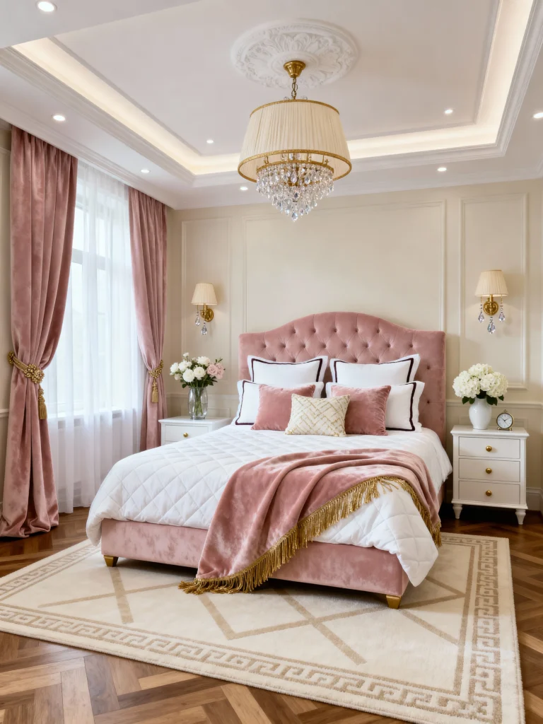
11. Warm Beige + Cream
Beige gets a bad rap, but hear me out. Warm beige with creamy off-white is like a cozy sweater for your walls. It’s neutral but not sterile, perfect for anyone who wants minimalism without the cold, clinical feel. I painted my bedroom this combo, and it’s like waking up in a fancy spa every day. Why settle for boring when you can have warm and inviting?
- Where to use it: Bedrooms, cozy nooks.
- Pro tip: Pair with natural fibers like jute rugs.
- Mood: Snug and serene.
12. Greige + White
Greige (gray + beige, FYI) is the unsung hero of minimalist palettes. Soft greige with crisp white is neutral but not boring, blending warmth and coolness like a pro. I used greige in my hallway, and it’s like my home got a chic makeover without breaking the bank.
- Where to use it: Hallways, open-plan spaces.
- Pro tip: Add mirrors to amplify light.
- Mood: Timeless and versatile.
Tips for Nailing Your Minimalist Palette
So, you’ve picked a palette—now what? Here’s how to make it work:
- Test before you commit: Paint swatches on your walls and live with them for a few days. Lighting changes everything.
- Balance light and dark: Too much dark feels heavy; too much light feels sterile. Find the sweet spot.
- Add texture: Think linen, wood, or ceramics to keep things interesting.
- Keep it cohesive: Stick to your palette throughout your home for that pulled-together look.
- Don’t overdo accents: Minimalism is about restraint. One or two pops of color are enough.
Final Thoughts
Picking a minimalist color palette is like choosing the perfect playlist—it sets the vibe for your entire home. Whether you’re into moody charcoals or sunny yellows, there’s a palette here to make your space feel like you. My personal fave? The sage green and white combo—it’s like a breath of fresh air every time I walk into my bathroom. So, which palette are you vibing with? Grab some paint swatches, get creative, and make your home the minimalist masterpiece it deserves to be. You got this!