
Hey there! So, you’re on a mission to find that one magical color that can waltz into any living room and make it shine, huh? A color that’s basically the MVP of interior design—versatile, stylish, and ready to vibe with anything. Well, buckle up, because we’re about to dive deep into this colorful conundrum. Spoiler: there’s no single “perfect” shade (sorry to burst that bubble), but there are some serious contenders that come pretty darn close. Let’s chat about it like we’re grabbing coffee and flipping through paint swatches together.
Neutrals: The Safe Bets That Never Fail
First up, let’s talk about the OGs of versatility: neutrals. You know the crew—white, beige, gray, and black. These colors are like that friend who gets along with everyone at the party. They don’t stir up drama, and they’re happy to let others shine. But which one’s the real champ for your living room?
White: The Bright and Airy Classic
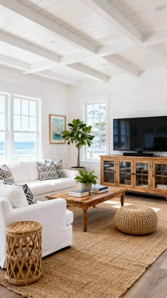
White’s a no-brainer, right? It’s clean, it’s fresh, and it makes any room feel like it’s got some breathing space. Small living room? White walls will trick your eye into thinking it’s bigger. Dark furniture? White brightens it up. But here’s the catch: go too white, and your space might feel like a dentist’s office. Yikes. My fix? Toss in some texture—think a shaggy rug or a wooden coffee table—and maybe a few bold pillows. I once painted my apartment white and thought, “Wow, this is crisp!”… until I realized it was too crisp without some cozy accents.
Beige: The Cozy Crowd-Pleaser

Then there’s beige. Oh, beige, you safe little angel. It’s warm, it’s inviting, and it’s basically impossible to screw up. Pair it with anything—dark woods, bright reds, cool blues—and it just works. But, real talk: beige can get boring fast. I had a beige couch once, and without some spicy accents (hello, emerald green throw blanket), it felt like I was living in a bowl of oatmeal. Pro tip: Punch it up with a bold secondary color to keep things lively.
Gray: The Chameleon of Colors

Gray where it gets interesting. This color’s a total shapeshifter. Light gray feels airy and modern; dark gray brings the drama. It’s like the Goldilocks of neutrals—not too warm, not too cold. I’ve seen gray walls paired with everything from mustard yellow chairs to sleek black tables, and it always looks intentional. Just watch out—if your place is already dim, gray might make it feel like a rainy day inside. Balance it with warm tones like a leather sofa or some gold lamps. Trust me, it’s a game-changer.
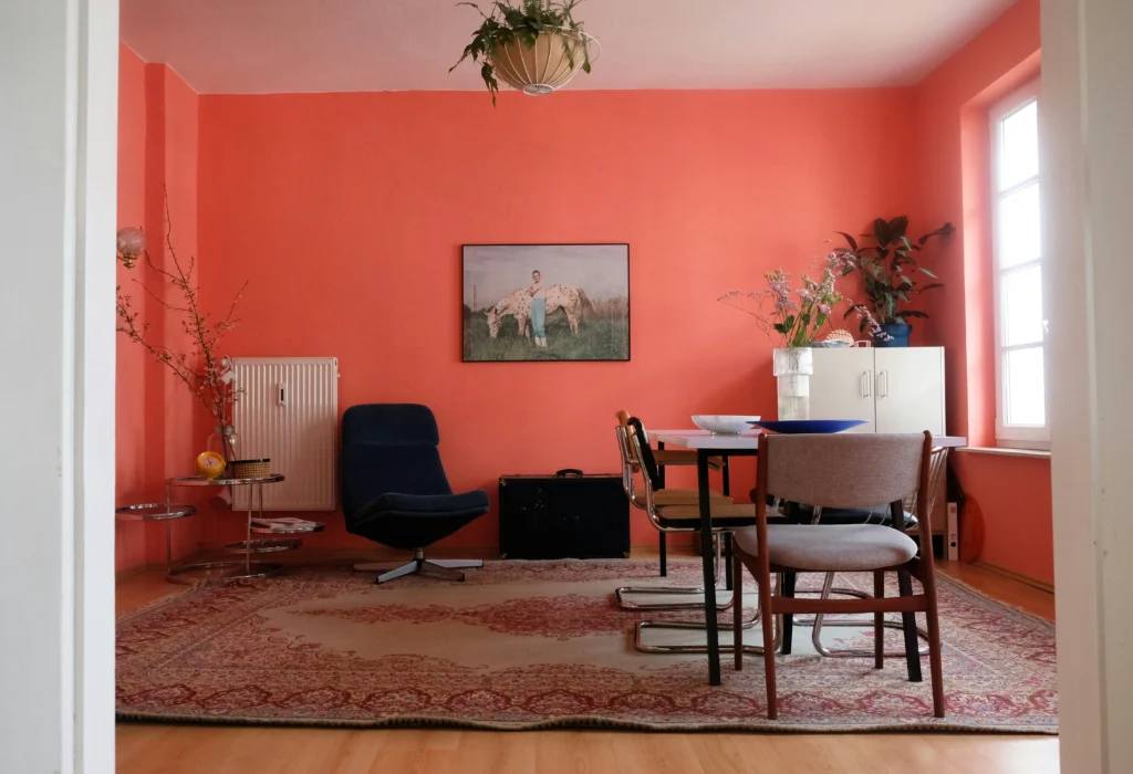
Black: The Bold Risk-Taker
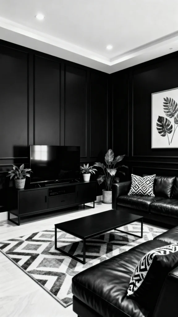
And black? Oh, black’s the rebel. It’s not for everyone, but when it works, it works. Think black accent walls or a sleek black coffee table. It’s edgy and chic, but you’ve got to commit. I tried a black rug once—loved the vibe, but it sucked up all the light. Lesson learned: pair black with whites or metallics to keep it from feeling like a bat cave. Black + gold = instant luxury, FYI.
Muted Tones: Personality Without the Chaos
Okay, neutrals are cool, but what if you want a little more pizzazz? Something that says, “I’ve got style,” without screaming it? That’s where muted tones strut in—colors like sage green, dusty blue, and soft terracotta. These are the cool kids that don’t try too hard.
Sage Green: The Trendy Zen Master
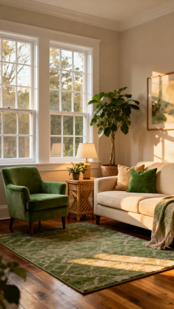
Sage green is everywhere right now, and I’m here for it. It’s calm, it’s earthy, and it plays nice with pretty much anything. Go full jungle with plants and wood, or keep it sleek with minimal vibes. I painted a friend’s living room sage green last year, threw in a gray sofa and some leafy decor, and it was like instant serenity. Why it works: It’s chill enough to blend but bold enough to stand out.
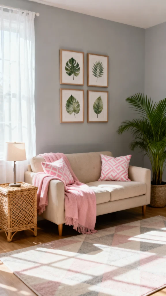
Dusty Blue: The Sophisticated Dream
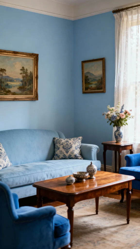
Dusty blue’s another gem. It’s got this soft, soothing vibe that makes your living room feel like a retreat. Pair it with white for a beachy feel or warm woods for something rustic. I’ve got a dusty blue armchair at home, and every time I add brass accents, it’s like the room levels up. It’s subtle but fancy—perfect if you want elegance without trying too hard.
Soft Terracotta: The Warm Hug
Then there’s soft terracotta. This color’s like a cozy sweater for your walls—warm, inviting, and a little Mediterranean. It’s awesome with creams for a mellow look or spiced up with turquoise accents. I saw a terracotta wall at a café once and thought, “I need this in my life.” It’s got soul but won’t overpower your space.
Patterns and Textures: The Secret Sauce
Here’s the deal: a single color’s great, but it’s patterns and textures that make it sing. A plain beige room? Meh. Add a striped rug or floral pillows? Boom—magic. These extras tie colors together and add depth. Mix stripes with geometrics, or go wild with an eclectic mash-up. Just keep the palette tight so it doesn’t look like a circus exploded.
Building a Palette That Pops
So, how do you make these colors work with everything? It’s all about the combo. Here’s a quick cheat sheet:
- Dominant Color: Your base—walls or big furniture (e.g., sage green walls).
- Secondary Color: Smaller pieces like rugs or sofas (e.g., beige sofa).
- Accent Color: Fun pops in pillows or art (e.g., terracotta cushions).
Or go monochromatic—different shades of one color, like light gray walls and dark gray curtains. Add metallics for flair. Feeling quirky? Mix it all up eclectically, but tie it together with a common thread (like a repeated color).
Trends vs. Timeless: The Eternal Debate
Trends are tricky, right? That millennial pink you love today might be tomorrow’s “what was I thinking?” Stick with classics like beige or gray, but modernize them with trendy accents—think a sleek lamp or bold art. Or use hot colors sparingly (a pink cushion beats a pink wall). IMO, it’s about what you love—trends fade, but your vibe doesn’t.
My Take: What’s Worked for Me
Personally, I’m Team Gray. I’ve got light gray walls at home, a navy sofa, and some mustard pillows—and it’s fire. It’s versatile enough to swap stuff out when I get bored (which is often), but it always feels cohesive. Plants help too—seriously, greenery fixes everything. 🌿
The Verdict: Is There One Color?
So, is there a color that goes with every color? Not really. But neutrals like gray and muted tones like sage green come close. The real trick: Pair them smartly. It’s less about the “perfect” shade and more about the perfect mix. So grab those swatches, play around, and make it yours. What’s your go-to color? Spill the tea—I’m all ears!