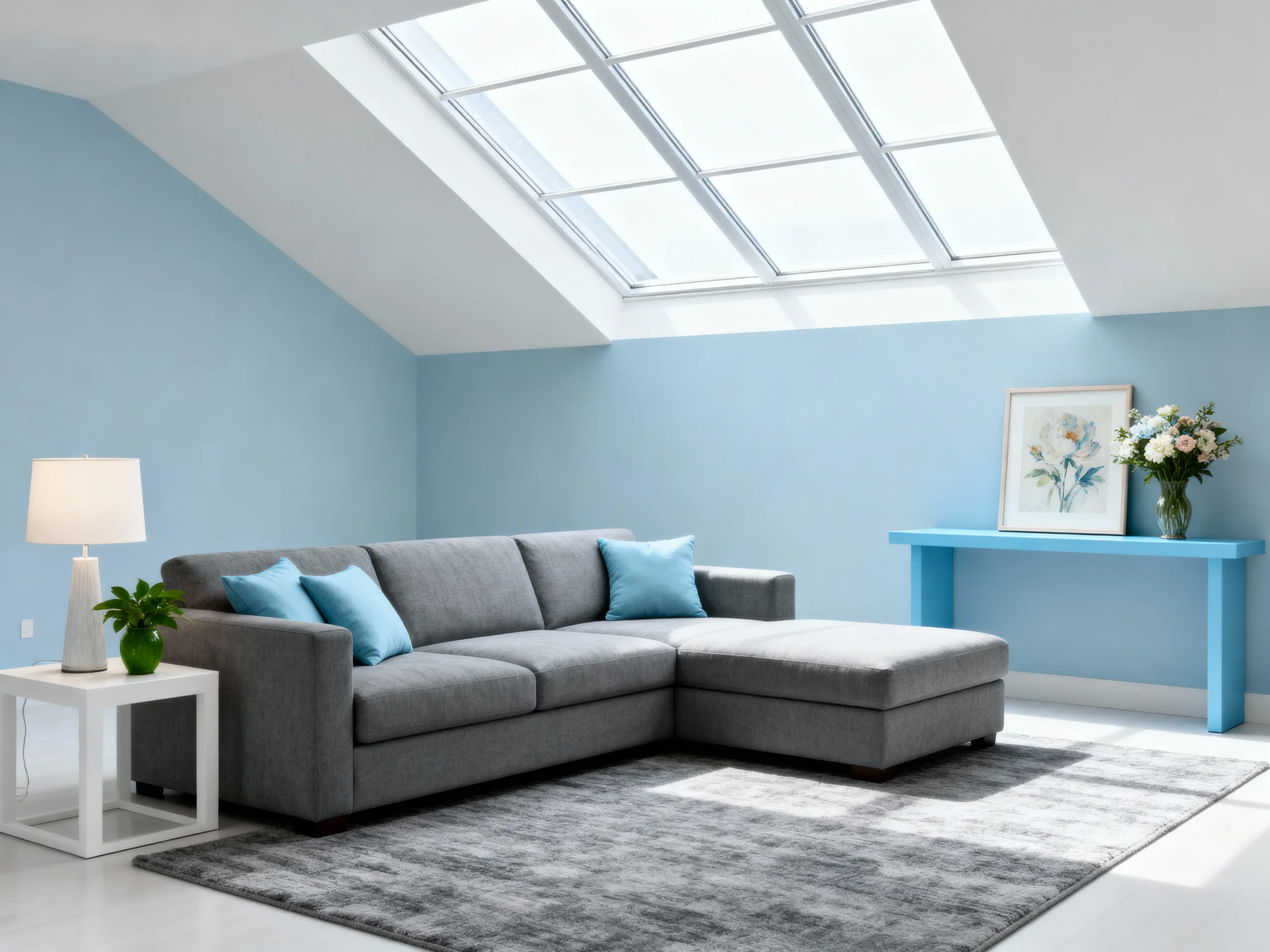
Have you ever felt like the walls of your tiny apartment are literally closing in on you? Trust me, I’ve been there. My first studio apartment in the city was so small that I could practically cook breakfast without getting out of bed. Not exactly the dream living situation I had imagined!
But here’s the thing – a small space doesn’t have to feel small. The right paint color can transform your claustrophobic cubbyhole into a breathable, inviting sanctuary. It’s basically magic in a can.
After years of experimenting with different shades (and making some truly questionable choices along the way), I’ve compiled my top 10 paint colors that can make even the tiniest spaces feel surprisingly spacious. Let’s dive in!
1. Cloud White
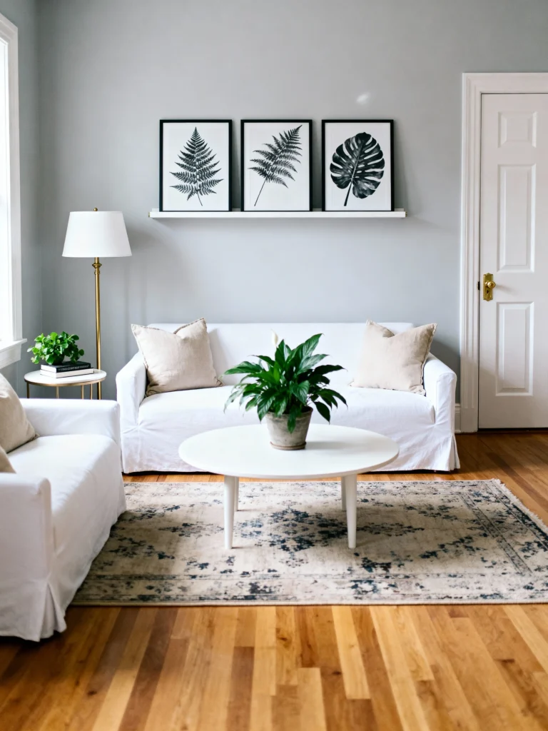
If you’re rolling your eyes thinking “great, another designer telling me to paint everything white,” hear me out! Cloud White isn’t your basic, boring white. It’s a soft, creamy shade with the slightest hint of warmth that makes a room feel airy without the clinical vibe of stark whites.
Why it works: This shade reflects natural light beautifully, creating the illusion of more space while adding a touch of coziness. It’s the perfect backdrop for literally any decor style you’re into.
I painted my narrow hallway this color, and the difference was immediate. What was once a dark tunnel is now a bright passageway that feels twice as wide. The best part? It doesn’t show scuffs as easily as brighter whites – a win for those of us who are a bit clumsy!
2. Pale Oak
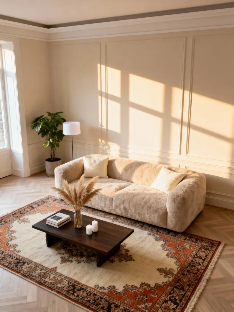
Looking for something with a bit more character than white? Pale Oak is your new BFF. This sophisticated greige (that’s gray + beige for the uninitiated) has subtle undertones that shift throughout the day, keeping your space interesting.
Why it works: The warm undertones prevent the room from feeling cold, while the grayish quality recedes visually, making walls appear farther away than they actually are.
My living room went from feeling like a shoebox to a legitimate lounging space after I applied this color. It’s neutral enough to match everything but has just enough personality to not be boring. IMO, it’s the perfect “grown-up” color that still feels young and fresh.
3. Skylight
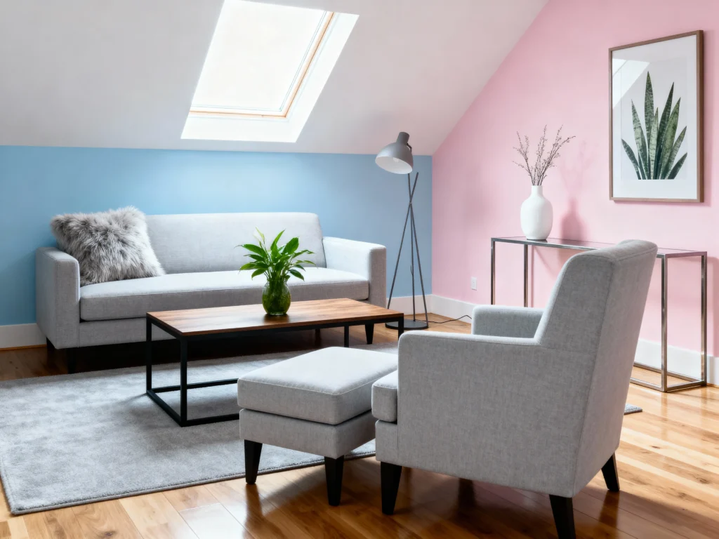
Don’t let the name fool you – this isn’t a bright blue. Skylight is a delicate, pale blue with gray undertones that creates a sense of openness reminiscent of, well, looking up at the sky.
Why it works: The subtle blue-gray quality mimics the atmosphere, creating an illusion of depth while staying light enough to reflect plenty of light.
I took a chance on this color in my bathroom (which was basically the size of a postage stamp), and suddenly it felt like I had room to actually move around! It’s particularly magical in spaces with limited natural light since it brightens without feeling flat.
4. Healing Aloe
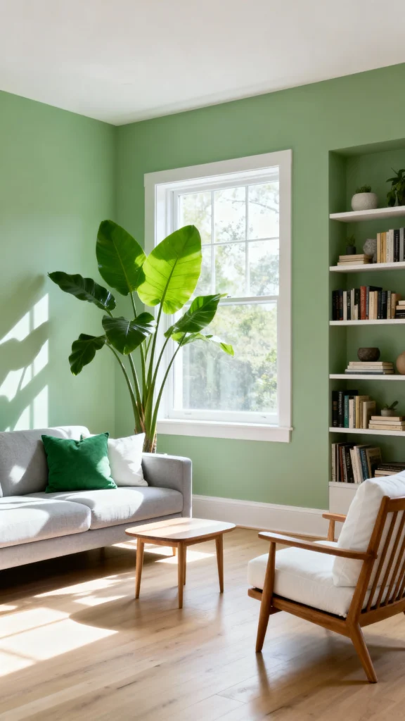
Need a pop of color without overwhelming your tiny space? Healing Aloe is that perfect mint green that somehow manages to be both a color and a neutral at the same time.
Why it works: This soft, restorative green brings the outside in, creating a sense of connection to nature that can make small rooms feel less confining.
When I painted my home office this shade, my productivity actually improved. Coincidence? I think not! There’s something about this color that feels fresh and calming without being distracting – perfect for a space where you need to focus.
5. Classic Gray
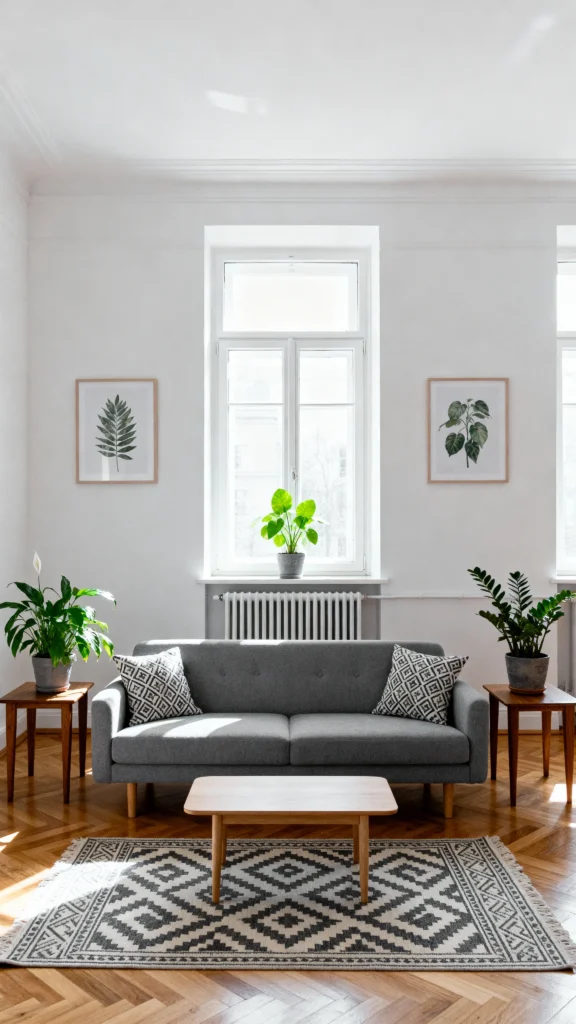
Don’t you hate when a “gray” paint turns out to be purple or blue once it’s on your walls? Classic Gray won’t play those tricks. It’s a true, light gray with warm undertones that keeps it from feeling cold or industrial.
Why it works: This chameleon-like shade has enough density to define architectural features while staying light enough to create airiness. It’s sophisticated without being somber.
This was the color that saved my north-facing bedroom from feeling like a cave. It manages to look bright even when natural light is limited and creates the perfect backdrop for both colorful accents and neutral bedding.
6. Pink Ground
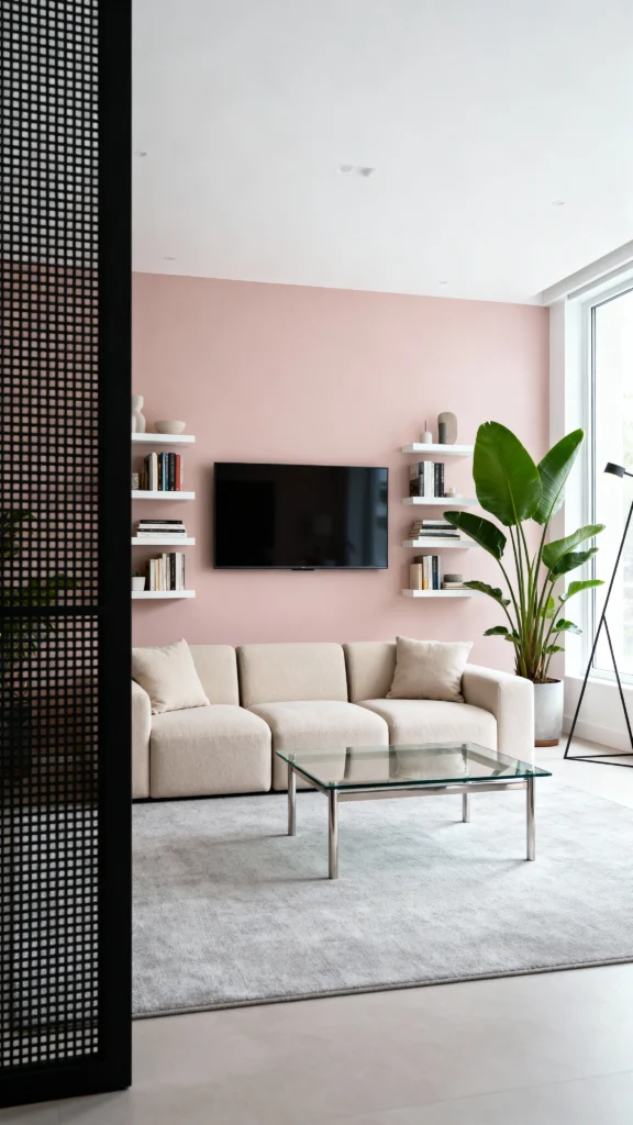
Before you skip this one thinking “pink isn’t for me,” give Pink Ground a chance! This isn’t your five-year-old’s princess room pink – it’s a sophisticated, barely-there blush that reads almost as a neutral.
Why it works: The warm undertones create a flattering, rosy glow that makes everything (and everyone) in the room look better, while the softness of the shade helps walls recede visually.
I painted an accent wall in my dining nook this color, and suddenly the space felt elegantly defined rather than cramped. It catches the sunset light in a way that makes even takeout feel fancy. And FYI, my boyfriend didn’t even realize it was pink until I pointed it out – that’s how subtle it is!
7. Silver Satin
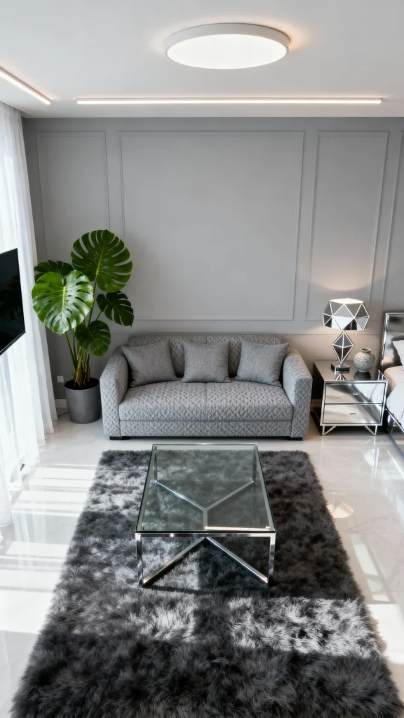
With a name like Silver Satin, how could this not make a space feel luxurious? This pearlescent off-white has the slightest silver undertone that catches light beautifully.
Why it works: The soft reflective quality creates depth and dimension, preventing that flat, one-dimensional look that can make small spaces feel boxy.
I used this in my entryway, which has zero natural light, and it immediately felt brighter and more welcoming. The slight sheen means it bounces whatever light is available around the room, creating the illusion of more space.
8. Borrowed Light
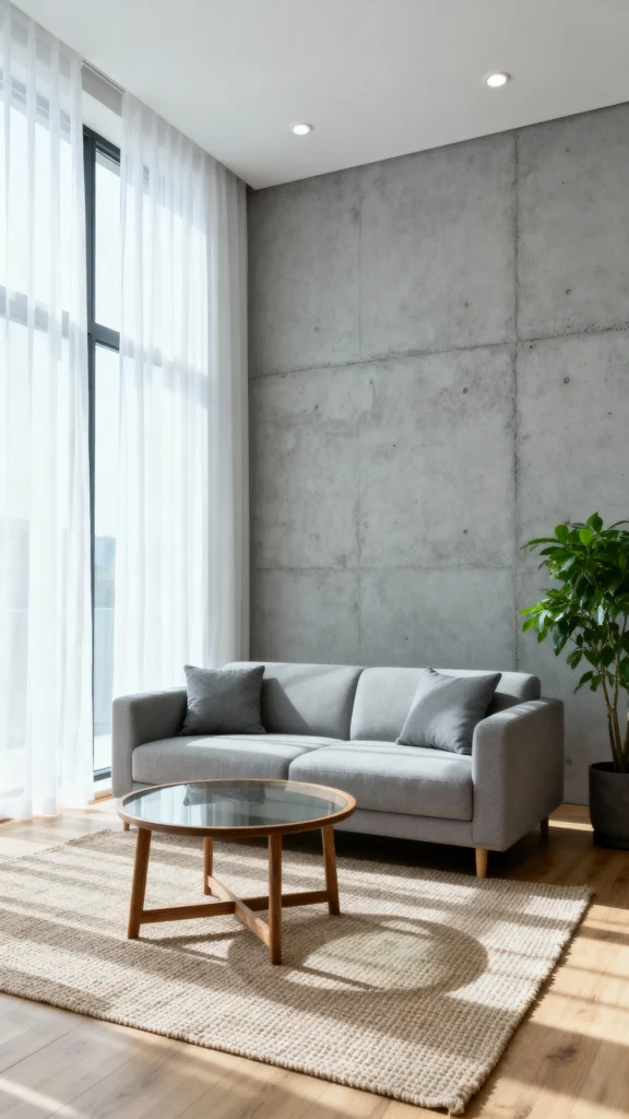
Can you actually “borrow” light with paint? This color makes a convincing case that you can. Borrowed Light is a delicate, ethereal pale blue that somehow manages to feel both airy and grounding.
Why it works: The color mimics the quality of diffused daylight, creating a sense of airiness even in rooms that are light-challenged.
My guest room/office was the smallest room in my apartment and felt like a closet until this color transformed it. Now it feels like its own distinct space with an almost meditative quality – perfect for dual-purpose rooms where you need to both work and relax.
9. Edgecomb Gray
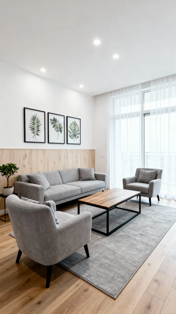
Is it beige? Is it gray? That’s the beauty of Edgecomb Gray – it’s the perfect marriage of both, creating a versatile neutral that works with absolutely everything.
Why it works: This chameleon color changes subtly throughout the day, adding interest without overwhelming. It’s light enough to feel expansive but has enough pigment to define the space.
After painting my kitchen this color, the continuous flow from my living space felt more intentional and harmonious. It’s one of those rare colors that looks good in EVERY light – morning, noon, artificial lighting, you name it.
10. Pale Powder
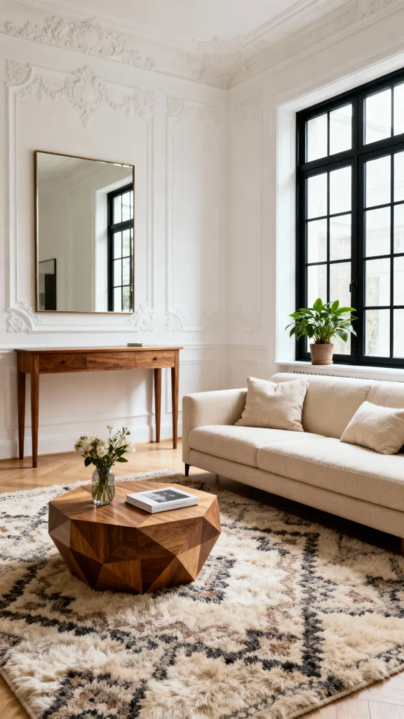
Rounding out our list is Pale Powder, a muted, atmospheric blue-green that defies categorization in the best possible way. It shifts between sage, seafoam, and pale blue depending on the light.
Why it works: The dusty quality to this color gives it a vintage feel that adds character to small spaces without overwhelming them. It recedes visually while still providing subtle color.
I took a chance on this for my reading nook, and it transformed a forgotten corner into the most coveted spot in my apartment. There’s something about this shade that feels like you’re wrapped in a soft blanket – cozy yet airy at the same time.
Tips for Using These Colors Effectively
Now that we’ve covered the colors themselves, let’s talk strategy. Here’s how to make these shades work even harder for your small space:
Consider the ceiling: Want your room to feel taller? Paint your ceiling the same color as your walls to eliminate the visual cutoff, or go a shade lighter to draw the eye upward.
Don’t forget the trim: In very small spaces, painting trim the same color as your walls (instead of stark white) can make the room feel more expansive by eliminating visual breaks.
Test, test, test: Those little paint chips lie! Always get a sample and paint a large swatch (at least 2’x2′) on your wall. Check it at different times of day before committing.
Think about your lighting: North-facing rooms need warmer colors to counteract the cool light, while south-facing rooms can handle cooler tones without feeling chilly.
Consider the flow: If you can see multiple rooms from a single vantage point (common in small homes), consider using different shades from the same color family for a cohesive look that still defines separate areas.
Beyond Paint: Other Small Space Optical Illusions
While the right paint color does most of the heavy lifting, there are a few other tricks that can enhance the spacious feeling:
- Add mirrors strategically to bounce light and create the illusion of depth
- Keep furniture low-profile to maximize the feeling of vertical space
- Use semi-gloss or satin finishes in very small spaces like bathrooms to reflect more light
- Consider painting built-ins or bookshelves the same color as your walls to help them visually recede
The Bottom Line on Small Space Colors
Remember, there’s no absolute “right” color for small spaces – the best color is one that makes YOU feel good in your home. These ten options are proven space-expanders, but your perfect shade might be something completely different.
What matters most is choosing a color with the right undertone and light-reflective qualities for your specific space. A color that complements your existing furniture, flooring, and the quality of natural light in your room will always feel more expansive than one fighting against these elements.
Have you tried any of these colors in your small space? Or do you have another magic space-expanding shade to recommend? I’d love to hear about your experiences!
Until next time, happy painting! Remember – in small space design, it’s not about the square footage you have, but how you use it. With the right paint color, even the tiniest apartment can feel like a palace.

