Hey there, color enthusiasts! Ever wondered why some color combos make your eyes happy while others feel like a punch to the face? Today, we’re tackling a big question: What two colors do not go well together? Spoiler alert: it’s not black and white (those two are basically BFFs). Grab a coffee—or a snack, I don’t judge—and let’s dive into this vibrant mess.
Color Theory 101: Why Some Colors Just Don’t Vibe

Okay, let’s start with the basics. Colors aren’t just pretty—they’ve got personalities. Some are chill, some are loud, and when you pair them up, it’s like a blind date. Will they hit it off or end in disaster? That’s where color theory comes in. It’s not as boring as it sounds, promise.
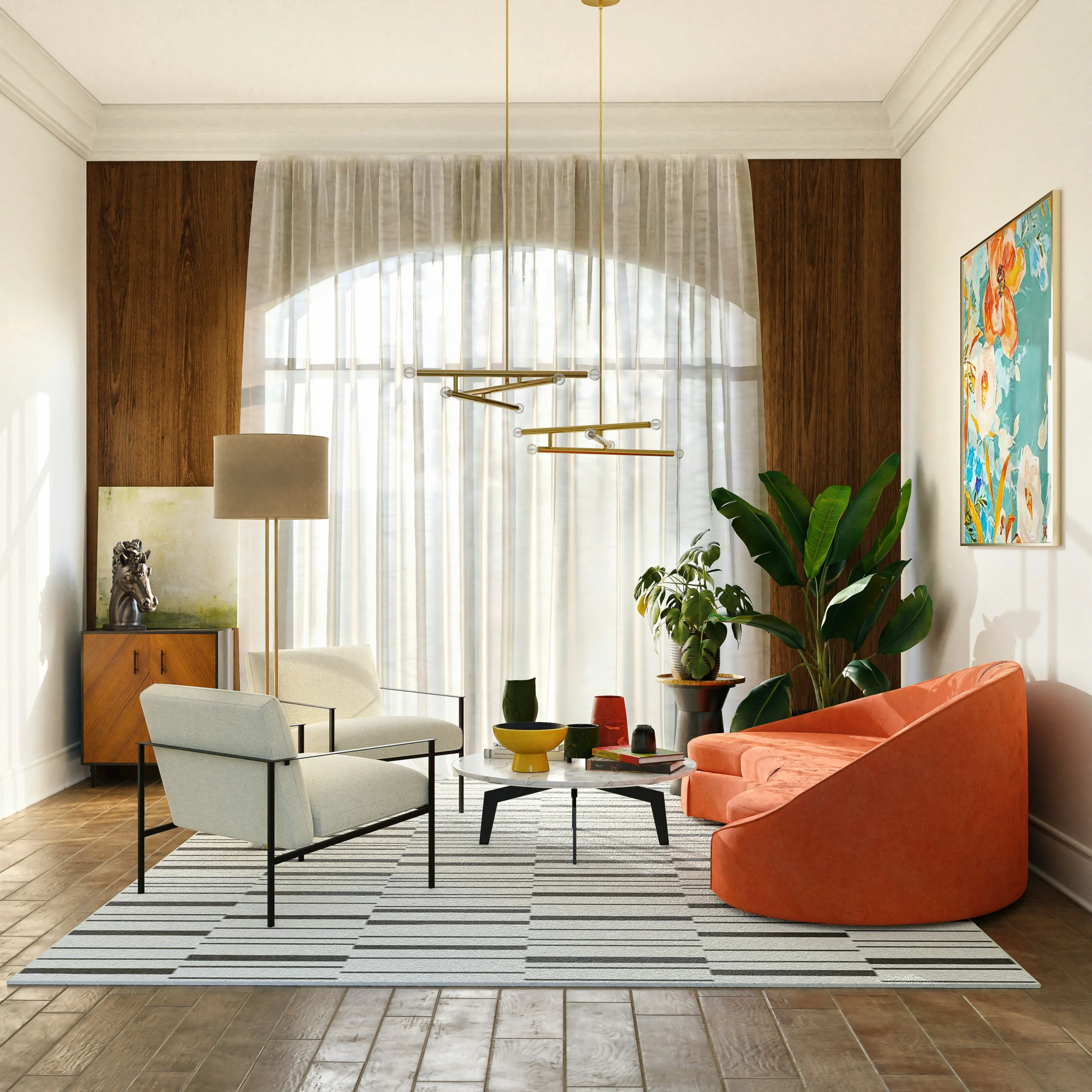
Colors opposite each other on the color wheel—like blue and orange—are called complementary colors. They can work together, but only if you’re careful. Too much of both, and it’s a visual shouting match. Then you’ve got analogous colors, like blue and green, which sit next to each other and usually get along. But even they can flop if the shades are off. Context is everything, folks.
The Usual Suspects: Red and Green
If I had to pick the ultimate clash, I’d go with red and green. Yeah, I know, they’re the stars of Christmas décor, and they look great on a wreath. But outside of December? Yikes. Picture this: a red shirt with green pants. You’re not a fashion icon—you’re a walking Christmas tree. These two are bold, attention-hungry, and refuse to share the spotlight. It’s like putting two divas on stage and expecting harmony.
Personally, I once tried a red and green combo for a painting project in college. My roommate took one look and said, “Dude, are you celebrating Santa early?” Lesson learned.
Orange and Purple: The Family Feud

Next up, orange and purple. These two are like cousins who only meet at awkward reunions and can’t stand each other. Both are loud, both are proud, and together? It’s chaos. Imagine an orange hoodie with purple shoes. Bold? Sure. Too much? Absolutely. They’re so vibrant they compete instead of complement.
I saw this combo at a thrift store once—an orange and purple dress straight out of the ‘80s. I almost bought it for the irony, but my closet couldn’t handle the drama.
Blue and Orange: Friends or Foes?
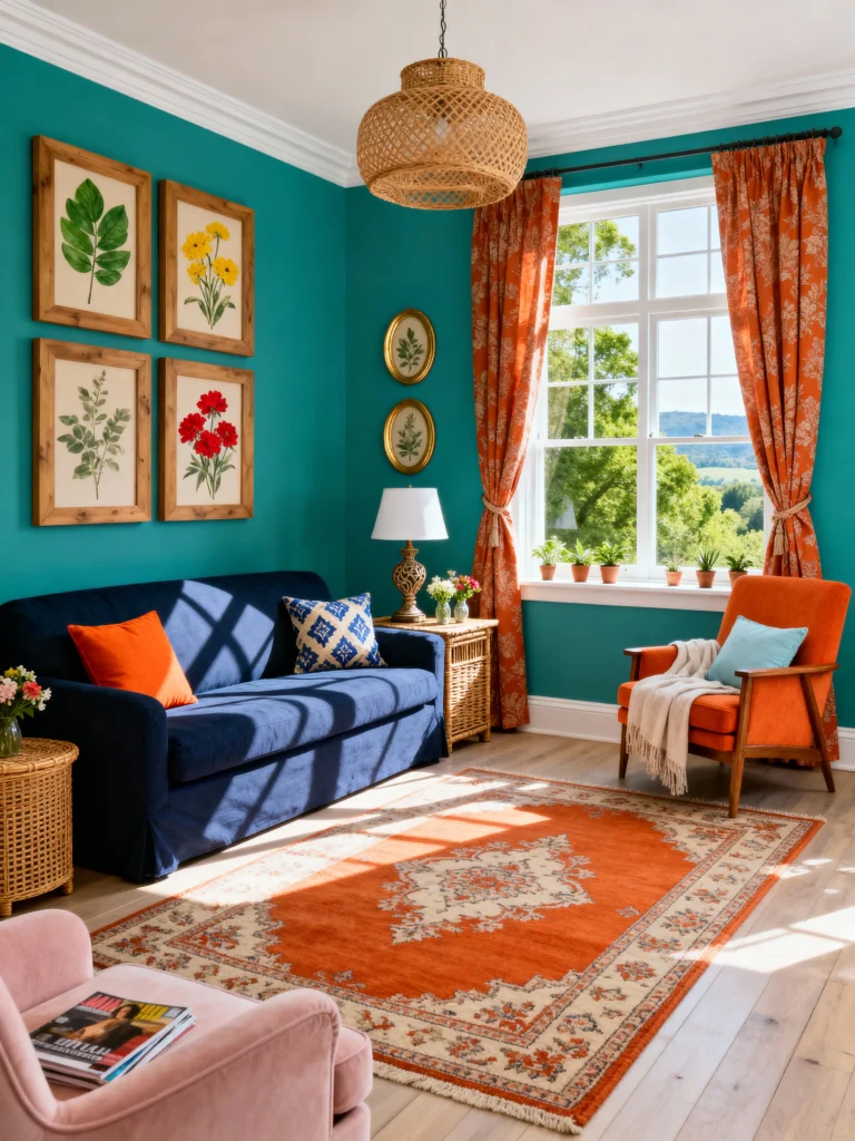
Now, blue and orange. You’re thinking, “Wait, don’t sports teams rock this all the time?” Yep, they do. And it can work—think movie posters or a sleek logo. But here’s the catch: when you slap them together in equal amounts, it’s a tug-of-war. Blue’s all calm and cool, while orange is screaming, “Look at me!” Side by side, they’re exhausting.
I tried this combo on a DIY project—a blue chair with orange cushions. Looked great in my head, but IRL? My friends said it felt like a budget airline threw up on my furniture. Balance is key, people.
Yellow and Green: Too Much Party Energy
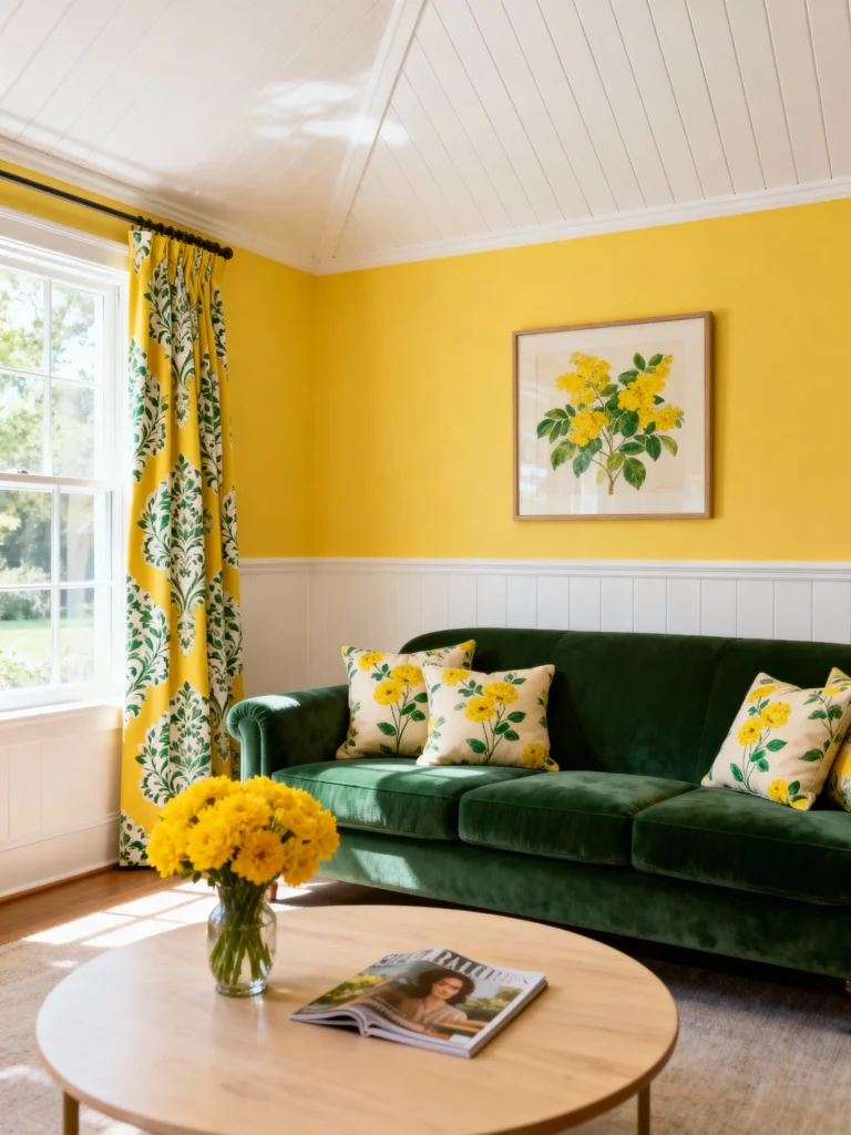
Let’s talk yellow and green. These two sound fun, right? They’re bright, they’re cheerful—perfect for a sunny day. But put them together, and it’s like a neon sign exploded. They’re both trying so hard to be noticed that you end up with a highlighter vibe. Unless you’re designing a rave flyer, this might not be the move.
I once wore a yellow shirt with green shorts to a picnic. My buddy squinted and said, “Man, you’re blinding me.” Never again.
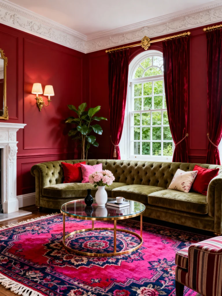
Pink and Red: Family Drama
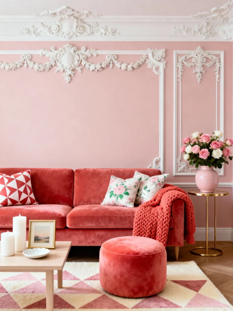
How about pink and red? Some folks love this duo, and I get it—they’re in the same family. But IMO, it’s a bit much. Pink’s soft and flirty, red’s loud and in charge. Together, they’re like siblings fighting over the remote. It’s confusing—like, pick a vibe already!
I painted a wall pink and added red curtains once. My sister walked in and asked if I was opening a Valentine’s Day store. Point taken.
Black and Brown: The Old-School No-No

Okay, let’s switch gears. Black and brown—for years, fashion gurus said this was a disaster. “Never mix them!” they’d scream. But times change. Now, it’s chic if you style it right—think black jeans with a brown leather jacket. Still, get it wrong, and it looks like you got dressed in the dark.
I rocked this combo for a date once. Felt like a trendsetter until my date said, “Oh, you’re going for retro, huh?” Confidence shaken.
Exceptions? Oh, Totally

Here’s the fun part: rules are made to be broken. Ever heard of the black and blue debate? Some swear they clash, but others pull it off like pros. And those “bad” combos? A skilled designer can make them sing. A pop of orange on a blue canvas? Stunning. A hint of green with red in a pattern? Festive and fresh. It’s all about how you play it.
My Verdict: Red and Green Take the Cake
So, what’s the final answer? If I’m picking two colors that just don’t go well together, I’m sticking with red and green. They’re the poster children for clashing—too loud, too proud, and zero chill. Unless you’re decking the halls, steer clear.
Safe Bets to Save Your Style
Want combos that don’t fight? Try these:
- Blue and white: Clean, crisp, and timeless.
- Black and white: Classic and foolproof.
- Gray and yellow: Subtle with a pop of fun.
These pairs are like the reliable friends who never let you down.
Tips to Avoid Color Catastrophes
Before you go wild with your next project, here’s some quick advice:
- Balance it out: Use one color as the star, the other as an accent.
- Check the shades: Bright red and neon green? Nope. Muted tones might work better.
- Test it: Paint swatches, fabric samples—try before you commit.
- Trust your gut: If it looks off, it probably is.
Why This Matters (and Why It’s Fun)
Colors shape our world—your clothes, your home, your vibe. Getting them right feels like a win, and avoiding a clash? That’s just satisfying. Plus, experimenting is half the fun. Who knows? Maybe you’ll turn orange and purple into the next big thing.
So, what’s your take? Got a color combo you love to hate? Drop it in the comments—I’m all ears. And hey, don’t be afraid to play with your palette. Just maybe skip the red and green unless it’s jingle bell season.