Picture this: I’d just moved into my first apartment, buzzing with excitement to turn my living room into the spot—somewhere I could kick back, host game nights. But then reality hit. Picking a color scheme? Ugh, it was like trying to choose between pizza and tacos—impossible and stressful. I wanted something that wouldn’t fade out of style faster than low-rise jeans. So, I rolled up my sleeves, tested some (questionable) paint swatches, and landed on 12 timeless living room color schemes that I’m obsessed with. Trust me, you’ll love them too. Let’s dive in!
1. Neutrals
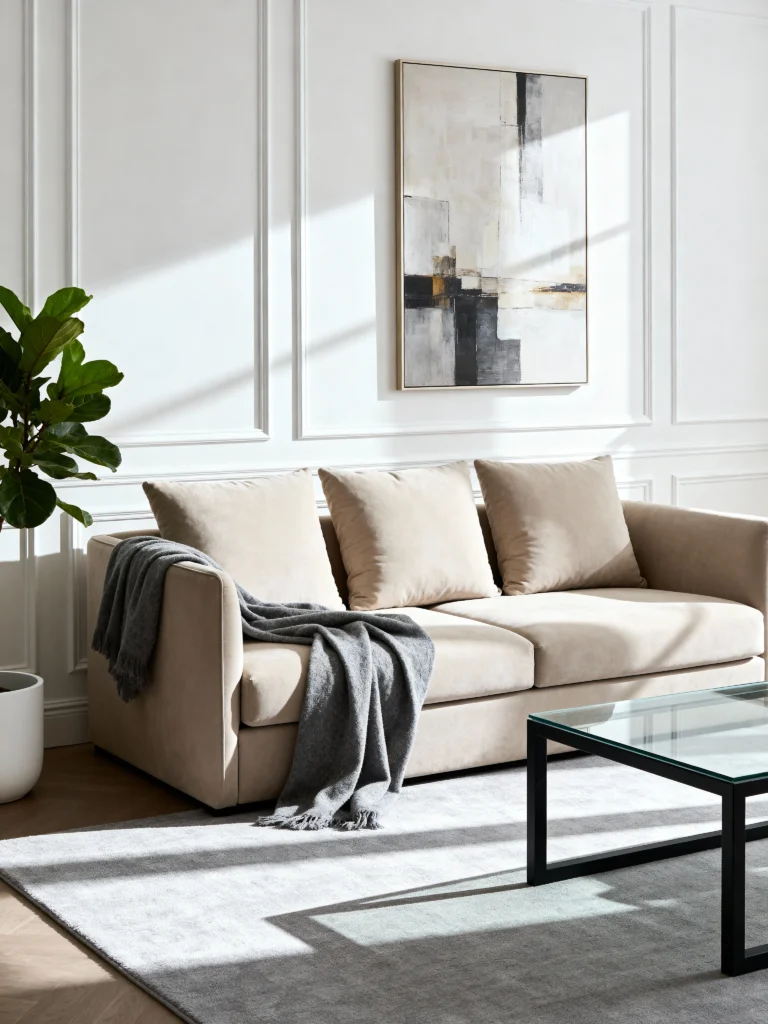
Neutrals are that friend who’s always got your back—reliable, chill, and endlessly adaptable. They set the stage for whatever vibe you’re feeling.
- Colors: Beige, cream, gray, white.
- Why it’s timeless: Neutrals never flop. They’re the foundation of every design era.
- How to use it: Splash bold accents for some spice, or keep it all neutral for that zen spa energy.
- Pro tip: Mix textures—think velvet cushions or a shaggy rug—to keep it from feeling flat.
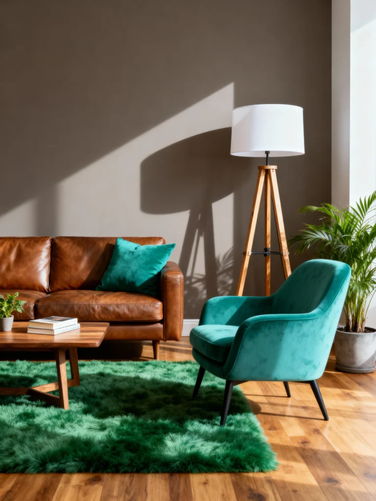
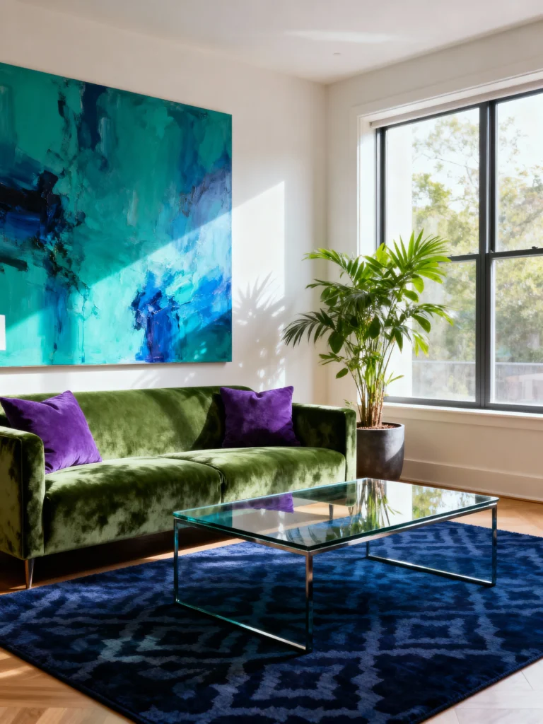
2. Complementary: Opposites Attract
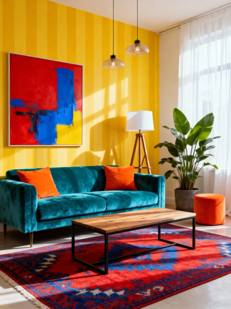
Remember the color wheel? Complementary colors sit opposite each other, and they pop like nobody’s business. Think of it as design’s power couple.
- Colors: Blue and orange, red and green, purple and yellow.
- Why it’s timeless: This duo’s been slaying since art class 101.
- How to use it: Go big with one color, then sprinkle the other as an accent—like a green sofa with red pillows.
- Pro tip: Chill on the balance—too much clash can turn your room into a circus.
3. Analogous: The Cool Kids Next Door
Analogous colors are neighbors on the color wheel, and they vibe together like besties. They’re smooth, easy, and oh-so-relaxing.
- Colors: Try yellow, green, and blue—or red, orange, and yellow.
- Why it’s timeless: It’s a no-fail harmony that never gets old.
- How to use it: Pick one star color, then let the others play supporting roles.
- Pro tip: Add a neutral if it starts feeling like a rainbow explosion.
4. Earth Tones: Mother Nature’s Hug
Earth tones wrap your space in a cozy, grounded feel—like nature decided to move in. They’re trending hard, but FYI, they’ve always been cool.
- Colors: Browns, greens, blues.
- Why it’s timeless: They’re as eternal as dirt and trees—literally.
- How to use it: Mix shades for depth—a brown couch, green pillows, blue rug.
- Pro tip: Add real nature vibes with wood or stone. Just skip the mud, yeah?
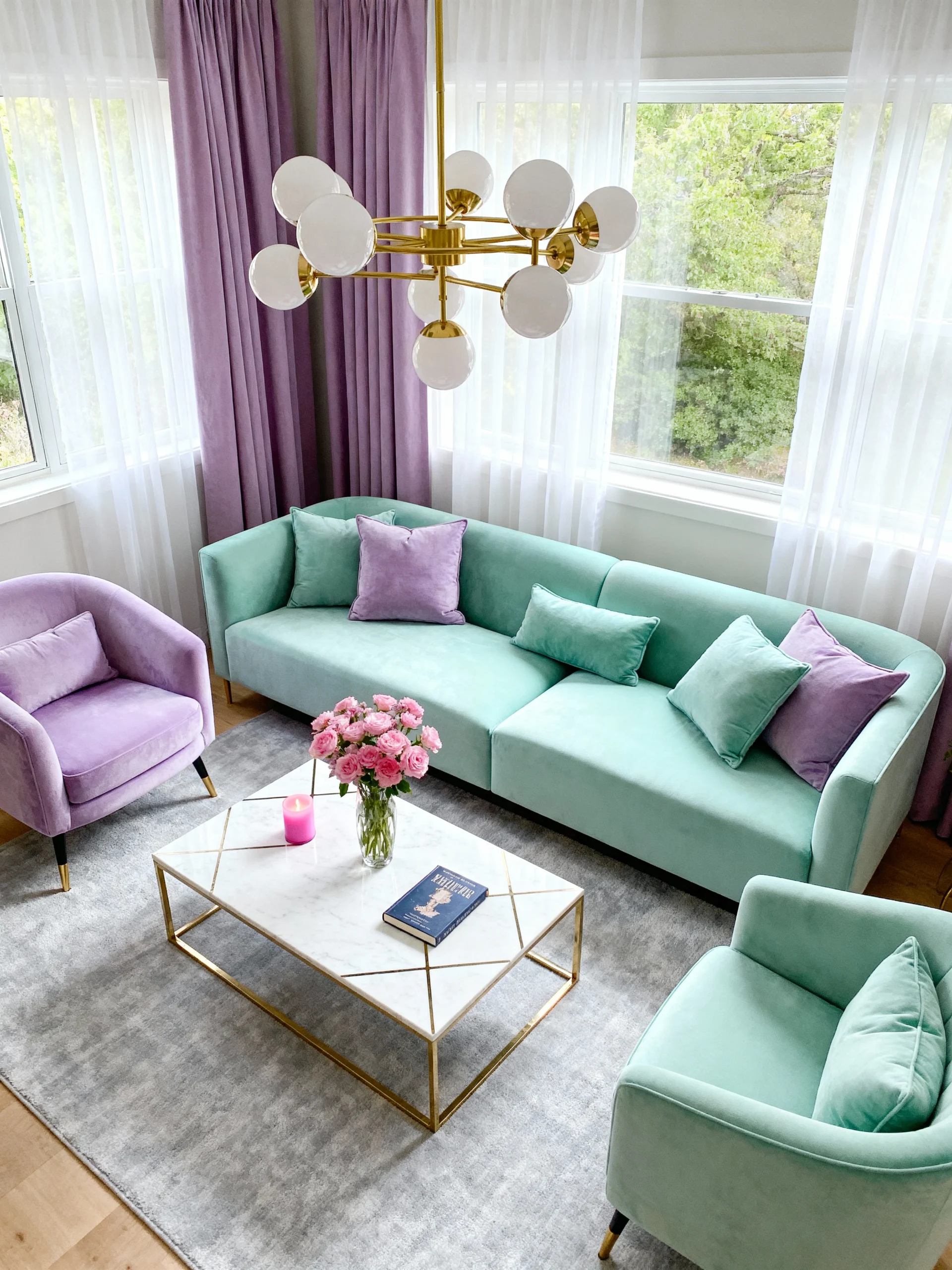
5. Pastels: Soft, Sweet, and Oh-So-Dreamy
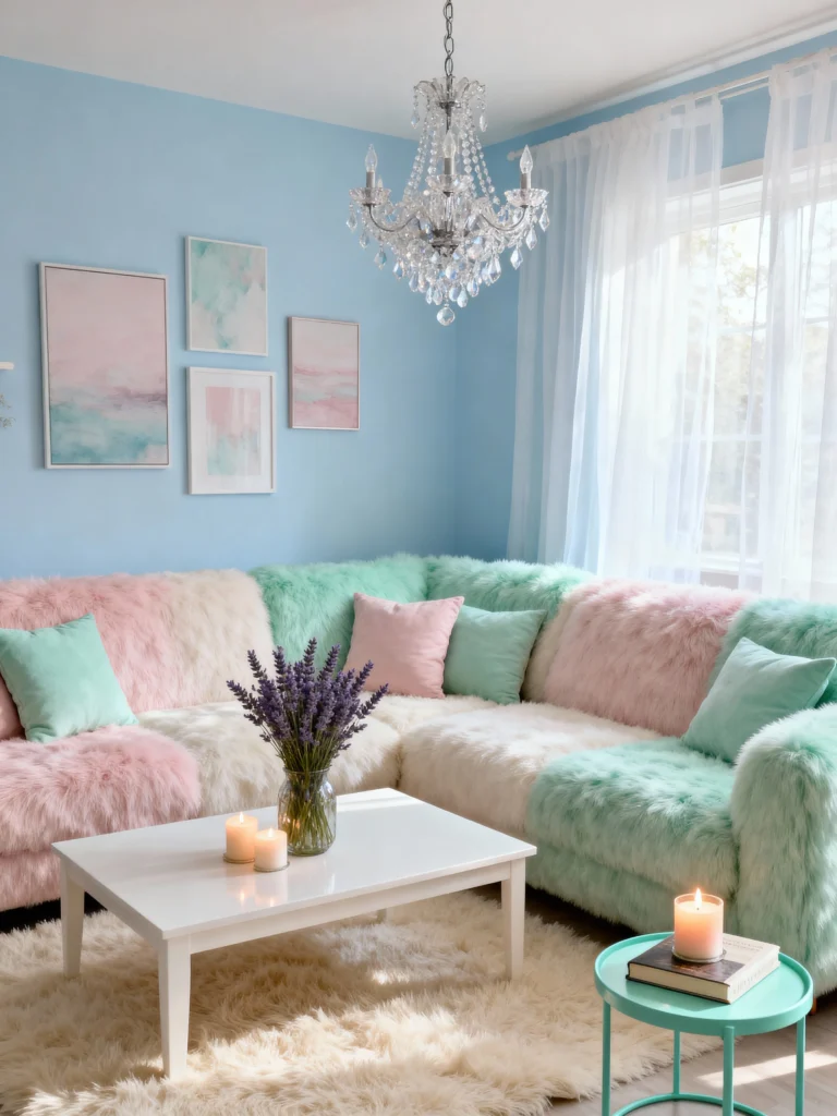
Pastels are the cotton candy of design—light, fluffy, and a little playful. They make your living room feel like a dreamy escape.
- Colors: Soft pink, mint green, lavender, baby blue.
- Why it’s timeless: That vintage charm keeps them forever fresh.
- How to use it: Slap pastels on walls or big pieces, then pair with white for brightness.
- Pro tip: Toss in some gold or rose gold to dodge that nursery look.
6. Black and White: The Ultimate Power Couple
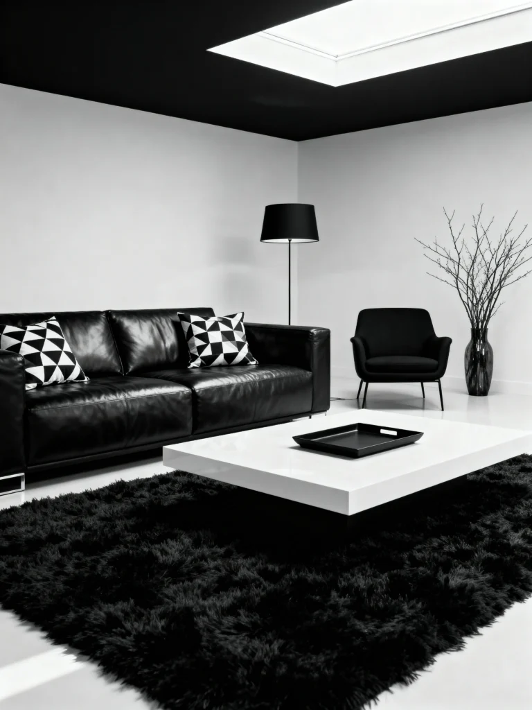
Black and white? Total classic. It’s sharp, chic, and basically foolproof. You can’t mess this one up.
- Colors: Black, white, maybe a gray cameo.
- Why it’s timeless: It’s been iconic since checkerboards were a thing.
- How to use it: Lean on white as the base, then punch it up with black accents.
- Pro tip: Sneak in a bright pop—like red—to shake things up. Instant wow factor.
7. Warm Tones: Cozy Up in Here
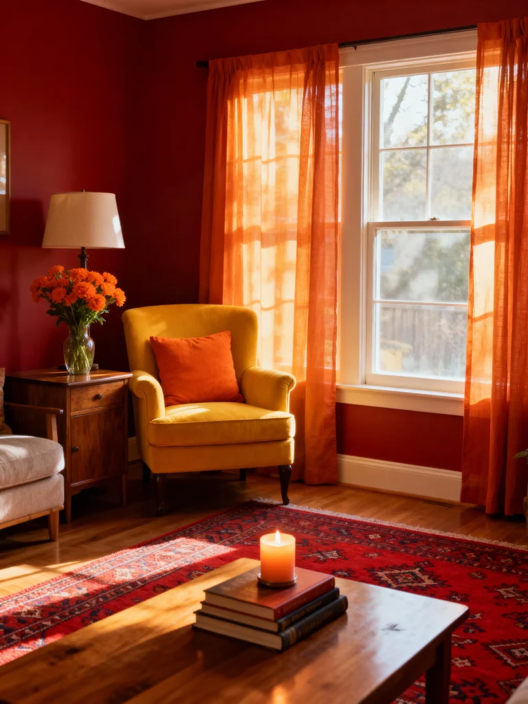
Warm tones turn your living room into a snuggly haven. I once went all-in with a red wall, and it felt like a cabin getaway. 10/10, no regrets.
- Colors: Reds, oranges, yellows.
- Why it’s timeless: They’ve been warming homes since fire was invented.
- How to use it: Paint walls or grab big furniture in warm shades, then cool it down with accents.
- Pro tip: Watch the yellow—it can go from sunny to “help, I live in a lemon” real fast.
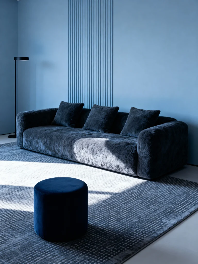
8. Cool Tones: Chill Vibes Only
Cool tones are like a deep breath—calm, fresh, and perfect for unwinding after a chaotic day.
- Colors: Blues, greens, purples.
- Why it’s timeless: They mirror sky and sea—stuff that’s never out of style.
- How to use it: Go bold with walls or furniture, then warm it up with wood or fabrics.
- Pro tip: Layer shades of one color for a slick, modern twist.
9. Metallics: Shine On, You Crazy Diamond
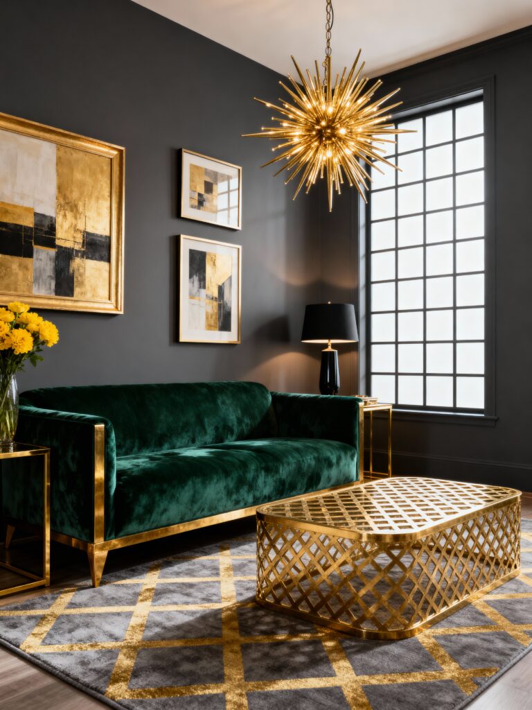
Metallics bring the bling—subtle, classy, and just extra enough. They’re the finishing touch your room didn’t know it needed.
- Colors: Gold, silver, bronze, copper.
- Why it’s timeless: From castles to condos, metallics always shine.
- How to use it: Keep them small—frames, lamps, vases—and let them sparkle.
- Pro tip: Pick one or two metals. Too many, and it’s disco ball territory.
10. Nature-Inspired: Bring the Outside In
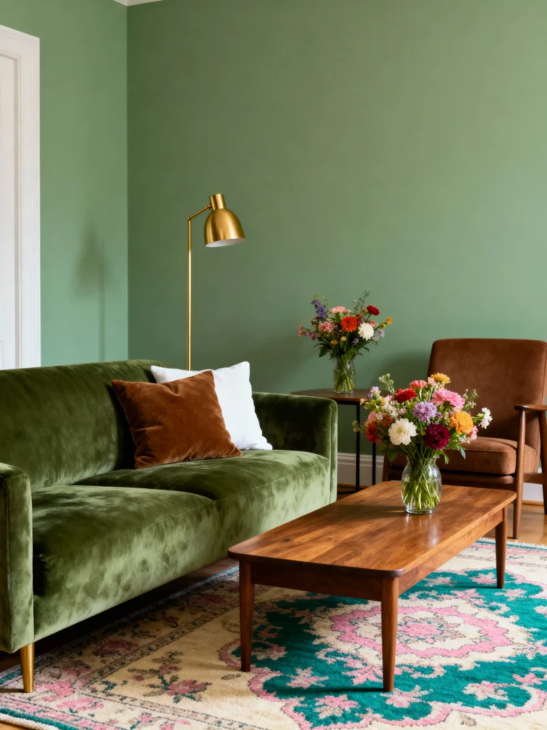
Nature-inspired schemes steal colors from the wild—think forests, oceans, flowers. It’s like your living room took a hike and loved it.
- Colors: Greens, browns, blues, with floral pops.
- Why it’s timeless: Nature’s palette never flops.
- How to use it: Pair with wood, stone, or plants for that earthy feel.
- Pro tip: Add floral prints for a soft touch—nothing screams “timeless” like a good botanical.
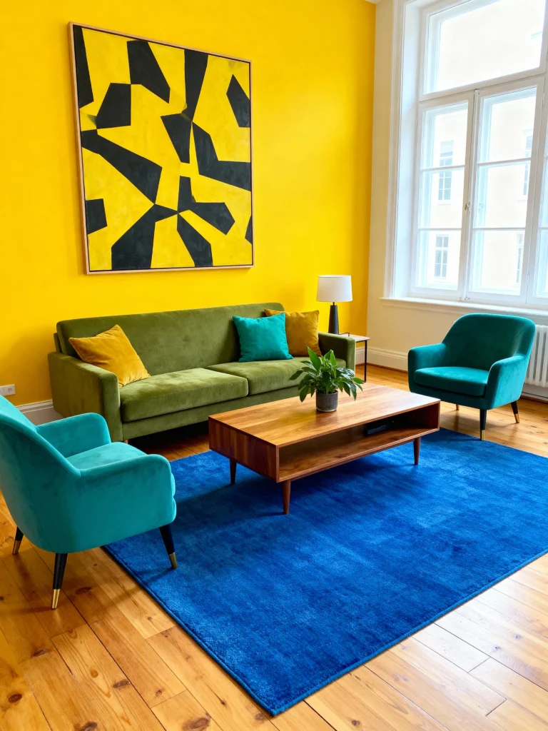
11. Vintage Vibes: Blast from the Past
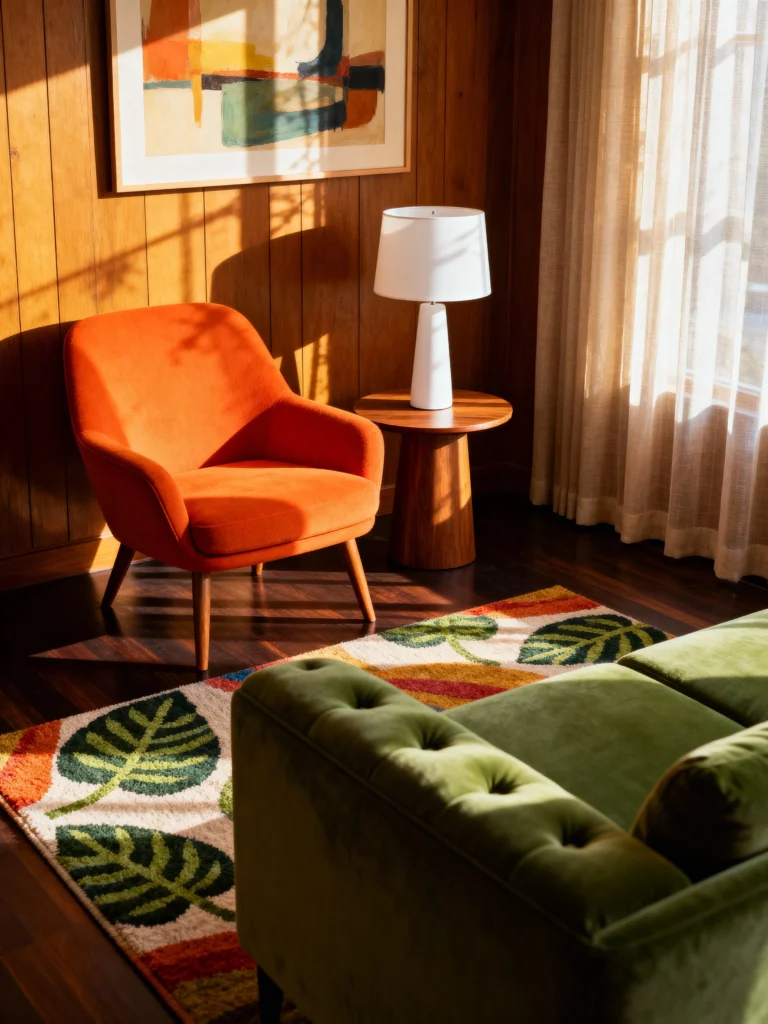
Vintage colors pull you back in time with retro charm. Think 1950s pastels or 1970s mustard yellows—nostalgia central.
- Colors: Era-specific shades like avocado green or burnt orange.
- Why it’s timeless: Old-school cool only gets better with age.
- How to use it: Choose an era, then commit—mix with modern pieces for balance.
- Pro tip: Blend vintage hues with sleek furniture for a vibe that’s fresh yet throwback.
12. Monochromatic: Fifty Shades of Fabulous
No, not that fifty shades. Monochromatic schemes take one color and run with it, using different hues for a sleek, put-together look.
- Colors: Pick one—like blue—and play with light to dark shades.
- Why it’s timeless: It’s clean, simple, and screams sophistication.
- How to use it: Start with your fave color, then layer it up across furniture and walls.
- Pro tip: Toss in a neutral or metallic accent so it doesn’t feel like a color overdose.
Your Living Room, Your Rules
So, what’s the takeaway? Picking a color scheme doesn’t have to make you sweat. Whether you’re vibing with neutrals or going bold with complementary colors, these 12 timeless schemes have your back. They’re like that perfect playlist—always a hit, no matter the year. Grab one, tweak it to your taste, and watch your living room turn into your space. Messed up? No biggie—paint’s cheap, and you’re a DIY rockstar now.